How I Treat My Portfolio Like a Product
Most portfolios aren’t bad. They’re just abandoned. I want to tell you about the most embarrassing fifteen minutes of my career. No code was broken. No server went down. Nobody…
Vishal Kr. Singh

Most portfolios aren’t bad. They’re just abandoned.
I want to tell you about the most embarrassing fifteen minutes of my career.
No code was broken. No server went down. Nobody fired me. It was worse than that — it was quiet, private, and entirely self-inflicted.
I was sitting at my desk on a Tuesday evening, nothing urgent on the agenda, and for reasons I still can’t fully explain, I opened my own portfolio. Not to update it. Not to share it. Just to… look at it. Really look at it. The way a stranger would.
I lasted fifteen minutes before I closed the tab.
The mobile layout was a disaster — text bleeding into margins, buttons stacked in ways that suggested no human hand had ever tested them on a phone. One project link returned a 404. The loading spinner on the hero section took so long that I actually said “come on” out loud, alone, to my own website. The “About” section read like a LinkedIn summary written under duress.
And here’s the part that really got me: I’d built this site myself. I do full stack work for a living — React, Node, Next.js, databases, the whole stack. I think about performance and UX and user flows every single day. I’d shipped products that people actually used and paid for.
But my own portfolio? I’d built it once, pushed it to Vercel, dropped the link in my Twitter bio, and mentally filed it under done.
Done.
As if a portfolio is a thing you finish.
The Delusion of “Done”
There’s a specific delusion that most developers carry about their portfolio — that it exists somewhere between a resume and a trophy case. You build it once when you need it (job hunting, usually), you fill it with your best work at that moment in time, and then you leave it there, quietly gathering digital dust, fully convinced that it’s “live” and therefore “working.”
I carried that delusion for years.
The tell was in the language I used when people asked about it. “Yeah, I have a portfolio site.” Have. Like a thing you possess. Not something you tend to, something you maintain, something that breathes.
Meanwhile, I was spending my professional hours obsessing over things like Time to First Byte, Core Web Vitals, component reusability, and whether a button’s hover state felt snappy enough. I had opinions about CSS architecture. I wrote tickets for accessibility improvements on client work. I cared, genuinely and deeply, about the craft.
Then I went home to a personal site where the favicon was missing.
The irony isn’t funny so much as it is instructive. The thing I was least rigorous about was the thing with my name on it.
The Night the Redesign Started
I didn’t plan the redesign. It started the way most good decisions do — accidentally, while doing something else.
I was going through my bookmarks and stumbled across a portfolio from another developer I followed online. It was remarkable not because of the visual design, though that was good, but because of how it felt to use. There was a “Now” page that said what they were currently reading and building. There were case studies that walked through actual decisions, including wrong turns. There was a changelog — a literal changelog, like a piece of software — documenting how the site had evolved over time.
I remember thinking: this person takes their portfolio seriously.
And then, uncomfortably: do I?
I opened vishalvoid.com in an incognito window. That’s important — incognito, so I’d see it exactly as a visitor would, no cached assets, no browser memory smoothing things over. I clicked through it slowly. I read the copy out loud, which is something I do when I want to hear whether writing actually sounds like a human being wrote it.
It didn’t.
That night, I opened a blank Notion doc and wrote three questions at the top:
Who is this site for? What do I want them to feel? What do I want them to do next?
I’d asked those exact questions a hundred times for client work. I’d never once asked them about my own site.
That was the beginning.
Thinking Like a PM About Your Own Name
Once you ask “who is this for,” everything changes.
My visitors aren’t a monolith. A hiring manager with seventeen tabs open and forty seconds of patience is not the same person as a developer who found my GitHub and wants to understand how I think. A potential client who’s considering hiring me for a project is not the same person as a student who came across one of my posts and wants to know if I write more.
Different people. Different needs. Different questions they need answered before they decide whether to care.
My old portfolio gave all of them the exact same experience: a hero section with my name in large type, a grid of project cards with tech stack badges, and a contact form. Clean. Symmetrical. Completely indifferent to the human on the other side of the screen.
Real products don’t do that.
Think about the last time you signed up for a tool you actually liked — Notion, Linear, Figma, whatever it is for you. From the moment you landed on the page, something was guiding you. The copy was speaking to a specific version of you. The onboarding assumed things about what you needed. It wasn’t designed for “everyone.” It was designed for someone.
A portfolio is a product. It has users. It has a job to do. And like any product that ignores its users, a portfolio that’s built for nobody in particular ends up working for nobody in particular.
What “Shipping” Looks Like When It’s Your Own Site
Here’s where treating the portfolio like a product gets genuinely interesting — and a little uncomfortable.
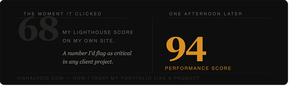
I ran a Lighthouse audit.
The score was 68.
Sixty-eight. On my own site. A number I would have flagged as a critical issue in any client project, a number that would have generated a ticket and a Slack message and probably a slightly passive-aggressive comment in a code review. And I’d apparently been fine with it on vishalvoid.com for the better part of a year.
I spent an afternoon on it. Converted images to WebP, deferred non-critical scripts, eliminated render-blocking CSS, fixed a layout shift in the hero caused by a font loading late. Score went to 94. It wasn’t complicated. It just required me to treat my own work with the same standard I applied to everyone else’s.
That gap — between how rigorously you treat client work and how casually you treat your own — is worth sitting with.
Then I added analytics. Not to watch numbers go up like some kind of personal vanity metric, but because I wanted to understand behavior. Where were people leaving? What were they actually reading? The answer surprised me: the project I was most embarrassed about — an older one, messier code, a domain that had lapsed — had the highest average time on page. Not because people liked it more. Because the case study was three times longer and more honest than anything else on the site. It talked about what went wrong. It talked about what I’d do differently.
People stayed because it was real.
Nobody told me that. The data did.
The Art of the Case Study
Let me draw a line between two things that look similar but aren’t.
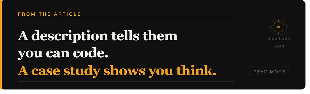
A project description: “Built a full-stack task management application using React, Node.js, and PostgreSQL. Implemented authentication, real-time updates, and a REST API.”
A case study: “The client wanted a simple task manager. Two weeks in, we realized ‘simple’ meant completely different things to the two founders — one wanted Notion, the other wanted a spreadsheet. That tension shaped every architectural decision we made, and getting it wrong once taught me more about scoping than any book has.”
One of those tells me you can code. The other tells me you can think.
Recruiters and clients aren’t just hiring someone who knows React. They’re betting on someone who can figure things out when the spec is wrong, when the requirements shift, when the original plan meets reality and falls apart. Case studies are where you show that capacity. Tech stack badges are not.
The shift from project descriptions to case studies was the single biggest change I made to vishalvoid.com, and it changed the nature of every conversation that came out of the site.
Testing Your Own Contact Form (You Haven’t, Have You?)
Here’s a small exercise. Stop reading this for a second, open your portfolio, and fill out your own contact form.
Go ahead. I’ll wait.
If you actually did it: what happened? Did you get a confirmation? Did the email that arrived look professional? Did it have a subject line? Did it come from a real address or from noreply@someformservice.io?
When I tested mine, the response email had a subject line that said “New Form Submission” and a body that looked like a database dump. That’s the last thing someone sees after deciding they want to talk to me. That’s the closing moment of an experience that might have taken real effort to reach.
I fixed it the same day.
But it never would have happened if I hadn’t tested it. And I never would have tested it if I hadn’t started thinking of the portfolio as something with a user journey — a beginning, a middle, an end — rather than a static page that existed to be seen rather than used.
The 404 page. The favicon. The way your name appears in a Google search result. Whether the site renders gracefully when JavaScript is disabled. Whether the mobile experience is actually designed or just “technically not broken.” These aren’t small things. They’re the texture of the experience. They’re the difference between a portfolio that feels cared for and one that feels left behind.
Versioning as a Creative Practice
I started labeling my updates like software releases.
Not publicly — nobody needed to see a badge that said “v0.3” — but internally, as a way of thinking. v0.1 was the structural cleanup. v0.2 was the mobile overhaul. v0.3 was the case studies. v0.4 was adding a “Now” page: a single, plainly written page about what I’m currently working on, reading, and thinking about.
That page gets more unsolicited feedback than anything else on the site.
I think I understand why. In a world of static, frozen portfolios, a page that changes — that says “here’s what’s happening right now” — signals something important. It says: a real person is here. They’re active. They’re doing things. This isn’t a brochure that was printed in 2022 and laminated.
The versioning mindset did something else, too. It gave me permission to ship before things were perfect.
Perfectionism is the most common reason developer portfolios never improve. There’s always something that isn’t quite right, always a section that needs more work, always a reason to wait before updating. But if this is v0.4, then v0.5 can fix what v0.4 got wrong. The version isn’t a declaration of completion. It’s a checkpoint. And checkpoints keep you moving.
What Actually Changed
I want to be careful here, because this is where these kinds of essays usually veer into fantasy.
I didn’t get a dream job offer because my Lighthouse score went up. Nobody sent me a message saying “your contact form confirmation email is exquisite.” The changes were quieter than that.
Conversations got better. People who reached out after visiting the site referenced specific things — a decision I’d documented in a case study, a post I’d written, a project that mapped to something they were working on. They arrived with context. They’d done more than glance at the page. That almost never happened before, because before there was almost nothing to engage with.
Interviews felt different. Walking through a case study that includes a mistake and what it taught me is a completely different conversation than “here’s my GitHub.” One demonstrates thinking. One demonstrates activity. These are not the same thing, and interviewers know the difference even when they can’t articulate it.
And something subtler: I feel differently about my own work. Building the portfolio like a product — thinking about users, measuring behavior, iterating on copy, documenting decisions — forced me to actually reckon with what I’ve built and why it mattered. That kind of reckoning is uncomfortable. It’s also the closest thing to genuine professional clarity I’ve found.
One Question Before You Close This Tab
When was the last time you actually used your portfolio?
Not updated a project. Not shared the link. Used it — opened it in incognito, clicked through every page, read the copy out loud, filled out the contact form, tried it on your phone, ran a Lighthouse audit.
If the answer makes you a little uneasy, that’s useful information.
The portfolio isn’t done. It’s never done. The best ones are the ones that keep moving — small releases, honest case studies, pages that change because the person behind them is changing.
That’s how products work.
Your portfolio isn’t a trophy case. It’s a living argument for why someone should work with you. Treat it accordingly.
Start with one thing. Just one. Fix the mobile layout, or write a real case study, or test the contact form. Ship that. Then do it again.
That’s all a v0.1 needs to be.
Working on your own portfolio? I’d genuinely love to see it — drop a link in the comments or come find me at vishalvoid.com.
Tags: developer-portfolio personal-branding software-engineering web-development career